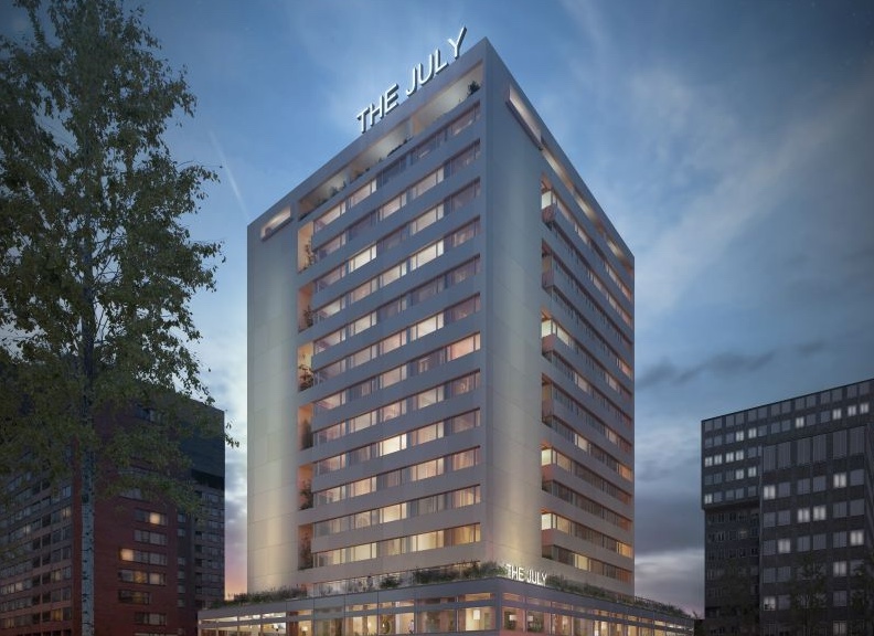
Netherlands: Aparthotel and serviced apartment operator YAYS has undergone a rebranding, with a revamped logo, new colour palette, renamed properties and more.
Born as Short Stay Group in Amsterdam in 2005 – long before Airbnb, the company introduced the YAYS brand in 2015 with “a sharp focus on the neighbourhood as an outlet for the city’s authenticity, cultural richness and uniqueness”.
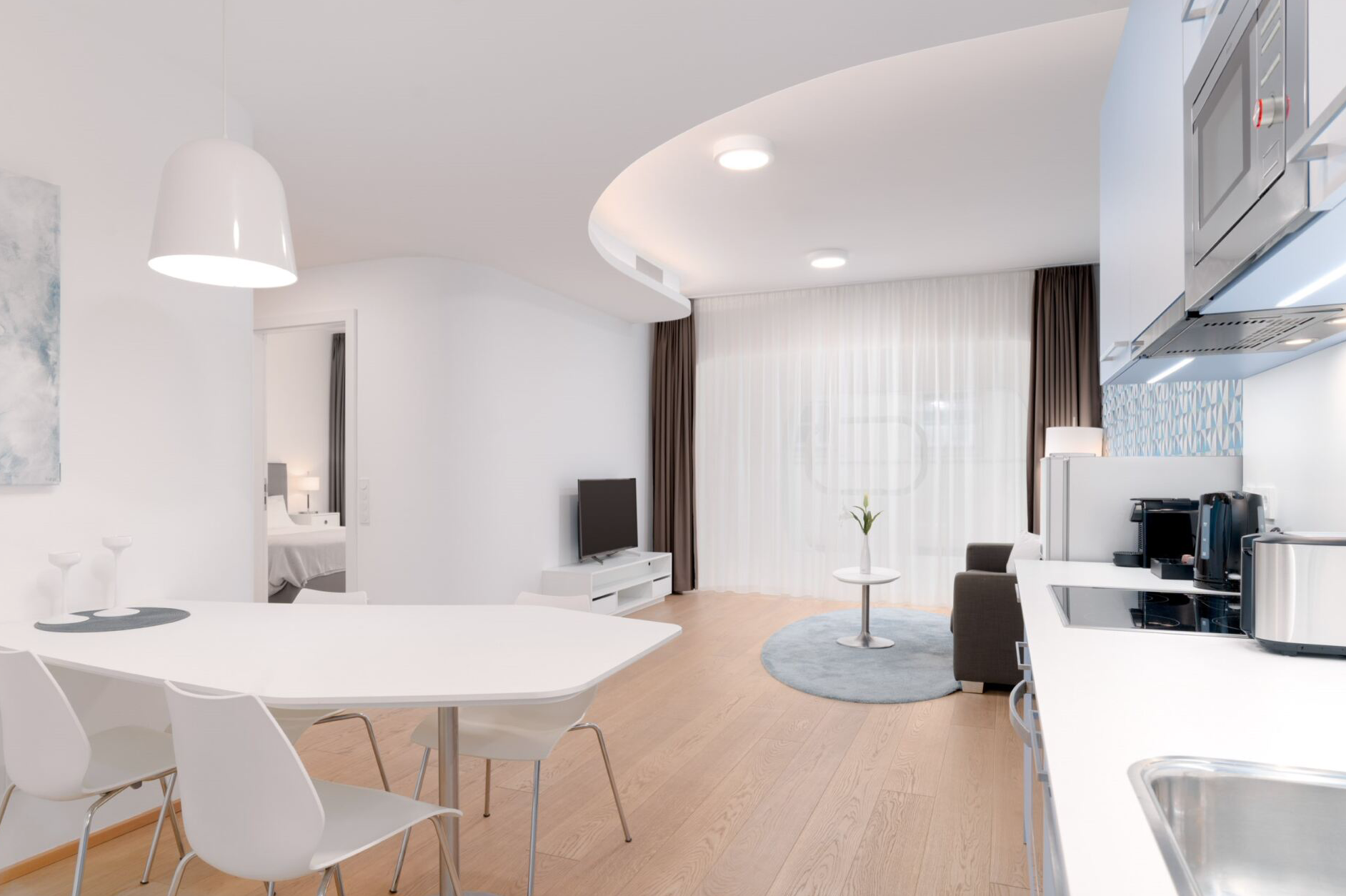
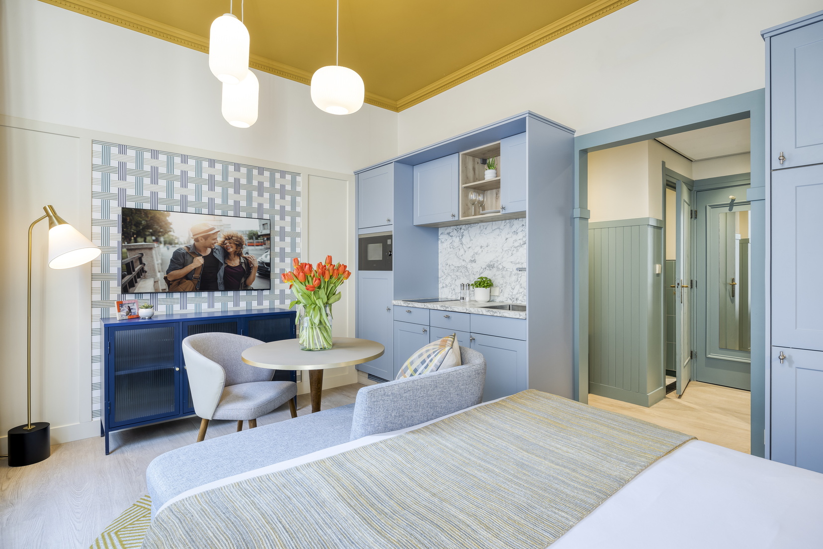
The company says today it combines “the best of hotel hospitality and independent accommodations in an innovative aparthotel formula rooted in urban sustainability”.
The rebranding includes a revamped logo – which preserves the crossroad symbol – a new colour palette, and the introduction of the YAYS red as the main brand colour accent.
To align the brand identity with the evolution of the YAYS Group portfolio, the company is launching a line of serviced apartments under the brand ‘by YAYS’ alongside the main YAYS brand and its aparthotels. The brand extension is characterised by a blue colour highlight.
The company has also renamed all its properties “to better capture the local spirit and improve the guest experience”.
Finally, front office staff have been renamed them YAYS Insiders.
YAYS CEO Zachary Schwartz said: “We’re excited to be embarking on the next chapter of the YAYS growth story with a full upgrade of our branding. While the YAYS promise to #unlocktheneighbourhood remains the same, these exciting brand upgrades will allow us to communicate with travellers in even more ways and to better showcase our spacious, fully equipped apartments across multiple European cities.”